Chargepoint SIGN UP
PROJECT AND ROLE
I led the redesign of the sign up process to make it easy for people to join ChargePoint. The sign up experience also helps users understand how to charge their vehicle for the first time. My responsibilities included: designing the interaction, creating prototypes in Invision, and creating final visual design. Another designer worked on the illustration and animations.
DESIGN
The goal for the design was to make the sign up process as simple as possible. Most of the calls to ChargePoint support are from new drivers who want to start a session. We also wanted to design the sign up process to explain to drivers how charging works.
To simplify the experience, I worked with a product manager to eliminate unnecessary fields. The earlier design required users to log in with their username. I redesigned the flow to allow users to log in with their email or username, to simplify the experience. The earlier design required users to enter an "EVatar name" that was their community name and also pick and “EVatar” icon. I simplified this by making the username the community name, and automatically assigning an icon during sign up that users could change later.

To help users understand how to charge, the tap-to-charge feature set up is included in the sign up process. Using NFC, the tap-to-charge feature makes it very easy for first time drivers to charge. All they have to do is tap their phone on the NFC reader at the station to start charging.
For users with Apple Pay and Android Pay set up, I simplified the payment set up by defaulting it to those methods.

To provide confirmation and move the user in the process, I wrote copy that is fun.

To encourage acceptance for notifications, I designed the screen to explain how they will be useful instead of just asking users to accept notifications.

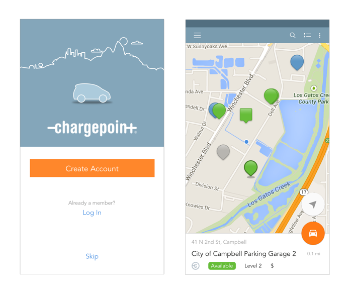
Drivers thought our app only showed ChargePoint stations, and were going to a competitor app to find information about other stations. Part of the reason for this was that signing up was mandatory in our app, and people didn’t know we showed other stations until they signed up. We changed that by giving users the option to skip sign up and see the stations on the map.
We continue to refine the sign up based on feedback. The main drop off for the 15% is on the payment screen, and we are trying new ways of funding to alleviate user concerns about how it works.
IMPACT
The current rate of completion is at 85%.
Our app is doing better than the competitor app based on App Annie data.